More Randoms


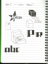
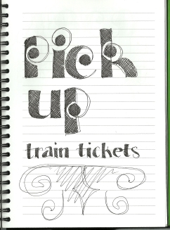
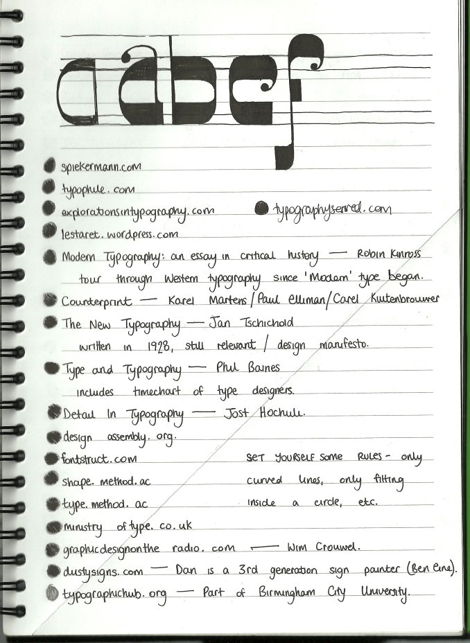
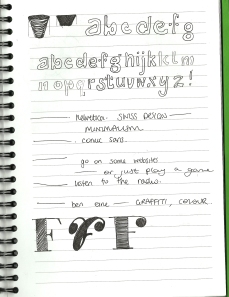
We’re heading towards the end of my third year university sketchbook, where genuinely good ideas are frustratingly sparse and every other page is either a to-do list or a snippet of mad, midnight-written dissertation. So here’s to the random pages!

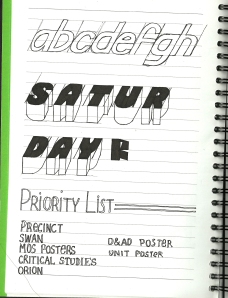
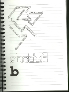
I have attempted a few 3D typefaces in the past, and this time I was determined to get my head around it properly. A few of these pages are just working out which way the letters would face, how many different variations you would need to create, and if letters can comfortably fit in this space.

The last page is particularly random; Leeds-based design studio UNIT were coming to give us a talk at University, and I was creating the promotional poster for the lecture. What is a single unit of hundreds and thousands called? I don’t know, but the plan was to create a typeface out of them. Did it ever happen? No, and neither did the talk… but it’s something I’ll get to eventually.

(In case you’re wondering, the shopping list was for Risotto Night, which was a renowned success.)

Plenty more fish in the sea…


Here’s a quick post about an idea I had a while ago. My sketchbook is full of new font concepts which often don’t get very far; I’ll sometimes start with the letter A and only get as far as B before realising it won’t work.

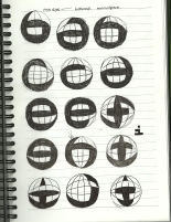
In this example, I attempted a ‘fish eye’ typeface. There are a few letters which look pretty funky, but overall I just don’t think this is ever going to become an accomplished typeface. When you see a few ‘o’s together, oooo, the surrounding white space is balanced in an uncomfortable way; these letters are never going to fit together beautifully, nor is the negative space going to look correct.

As ever, I love to hear what you guys think; please let me know if you think any of these letter look okay, if there’s any in particular you hate, or if you’ve had a go at this style yourself.

Precinct


Apologies for my lateness, aparently when I say ‘tomorrow’ I actually mean ‘in a month.’

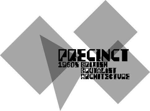
Recently I showed you the initial sketches for the commissioned typeface ‘Precinct.’ The rules I set myself for the characters were to use 45, 60 and 90 degree angles, making the letters very blocky and bold.

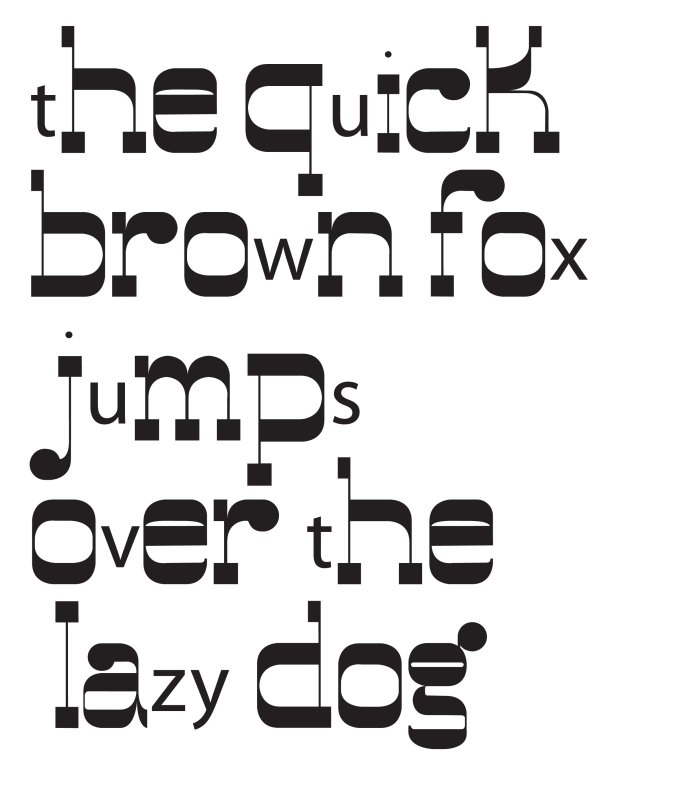
Without harping on, here are the letters:

I hope that as you look at these letters, you can begin to see large geometric shapes appearing behind them. For example, if you look along the line of ‘c’s and the first ‘d,’ it creates a horizontal arrow.

This feature of the typeface is almost like a stereogram, in that once you begin seeing the hidden shapes more seem to emerge. In this way, the font can be used to build blocky shapes like the ones it is inspired by; it is a very unique quirk which can be interpreted and manipulated by anybody using it.

Please let me know what you think of this typeface, how you might use it or whether you see any shapes behind the letters?

And now for something completely different…


Cygnine took it out of me! It took so long and was such a steep learning curve that I felt incredibly ready to begin something very stylised and different as my next project. In perfect timing, I was approached and asked to create a custom display typeface for a magazine about British Brutalist architecture.

It’s a pretty unusual brief if you don’t know about, or don’t really like, Brutalist architecture; it’s certainly an aquired taste! The buildings can be modestly summarised as ‘looking like car parks…’

The typeface would be angular, brutal, strict, and ugly but in a charming way. Here are some initial sketches:


I did quite like the middle page, but then it all started looking a bit too ‘Olympics,’ so I backed away…

The letters on the top of the first page had potential, as they are so black and uncompromising, so I decided to roll with that concept…


I hope you can now see where I’m going with these letters; they are very bold, and the counter spaces are pretty unusual. I would draw a bold outline of the letter first, and then deal with the counter later. This is basically how not to do typography, as the negative space should generally be considered just as much, if not more, than the actual letter. However, some might argue that Brutalism is how not to do architecture?

Once I showed the client where I was going with this idea, it was approved and I wanted to set myself some rules to follow… as I tell many of my followers, often the best way to get started with a project is with some rules.

Considering where the inspiration for this typeface came from, I decided to set myself some angles to use throughout the font. In the 1960s, there was no CAD software for architects; all designs would have been drawn out isometrically. The angles used for this kind of drawing tend to be 30° and 60°.

So, the basic rules for my letters were that they had to be big, chunky, and use 30°, 45°, 60° and 90° angles only. I stuck with these rules while creating the letters, unsure of quite how ugly they’d look, and I’ll show you the result tomorrow!

Cygnine… finally.


Guess what everybody… I have a First Class Honours Degree in Graphic Arts and Design! I am very happy. Yay me!
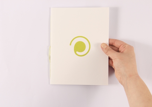
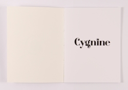
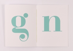
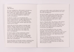
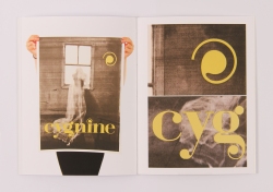
Anyway, on to that pesky typeface I’ve been going on about for a very long time… I have settled on the name Cygnine; it means ‘swan-like’ in Latin. Here is the specimen book I created, to show off the typeface; please let me know what you think.

Enough is Enough


Apologies for my silence over the last couple of weeks, I have been so busy. Rubbish excuse I know, but to be fair I have completed my degree, been creating some logos and new typefaces, and working on the end of year show, and the publication for it!

The show is still open to the public for the rest of the week, why not pop along? There is incredible talent on show, from so many different courses.

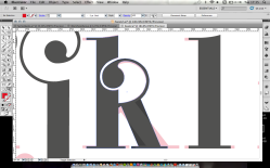
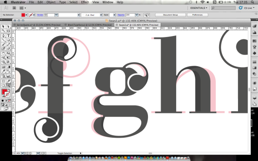
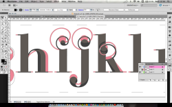
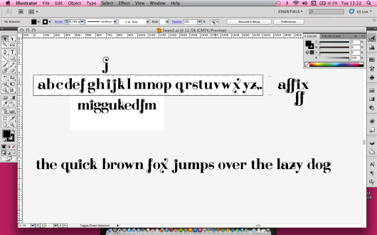
I think we’re all sick of hearing about how my Didone typeface is coming along, and I’ve nearly had enough of talking about it! So here are some images showing the finishing touches to the font. It was created in Illustrator, and copied across to Fontographer, as I’m more comfortable working in the Adobe programmes. A quick mention to Mr Jeremy Tankard, one of my favourite typographers; he gave me a few pointers with some of my letters. He really was an incredible help and is very welcoming to students, offering advice to people who genuinely want and ask for it.

Tomorrow I’ll post the final typeface but for now, enjoy my mistakes/remakes…

Type Savvy


Something I have to be wary of when designing a typeface is to hold back sometimes. Embellishment is lovely if done modestly and balanced well over the whole alphabet, numbers, punctuation and any other glyphs a font has; but it’s easily overdone.

The typeface I have been talking to you all about recently, called Swan, is distinguished by the swashes on most of the letters. However, it can be extremely distracting reading a whole passage of text which is set in an over-the-top font. The letters are legible, in that each letter is identifiable, but the whole piece would not be readable.

Sometimes I find myself getting carried away, and trying to add a lot of details to letters which simply don’t. need. it.

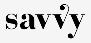
Because of this, a while back I decided that the best way to utilise my typeface would be to turn it into two styles; a regular, and a swashed display typeface. Some of the letters are exactly the same, but the more elaborate version can be used for headlines or posters, while the regular version is more readable for chunks of text. As an example, check these vs:


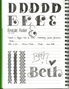
You sometimes have to be ruthless in choosing which letters make the cut; you can see below how many ideas for capital letters there are in my sketchbook:


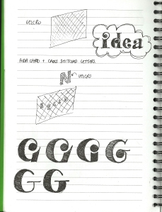
But you can see that the G i have decided on is quite reserved compared to some of these:


In other news, I’ve got twelve days to finish my degree so my posts may be sparse over the next few weeks, but wish me luck!

December2011


Althought you can see some Swan typeface sketches here, there are also a few experimental pieces. By this stage, I had started creating the font in Illustrator, which would then be copied across to Fontographer when complete.

The second page is something I thought of on the train – if I were to create a cube typeface, I could make the capital letters a full cube, and the lowercase would have no left hand-side showing, so it would look like boxes sat next to each other. I hope that makes sense – I’m going to create a post about it soon so hopefully that will explain it better!

I think that most typographers have a letter which they like drawing the most, and which can become a catalyst for an entire typeface. For me, I thik it is probably the capital letter A. I have no idea why really – it might sound uncreative but it’s probably simply because that’s where the alphabet starts! You can see that I have tried incorporating some curved lines into a very rigid letterform, including trying to make it entire out of circles, including the serifs.

Much more swan stuff coming soon – have a good weekend!

Entente Workshop


The pages are the result of a one-day workshop we had at university, run by Ant and Edd from the Entente.

The concept of the workshop was to create a typeface out of a system. The system could be anything – a simple idea you want to stick to, restricting yourself to using a certain shape for all the letters, or creating letterforms directly from a grid.

The ideas which I explored are below. I began by thinking about bitmap fonts – designed for screen, these fonts use as little as 6 pixels for the height of most letters. I considered how I could change such a strict existing system – perhaps by taking it out of its ‘natural environment’ and making it very large, or creating italic styles. From this, the idea was born that I could make a fish-eye font; the intial idea is the second page below.

However, once I’d had this idea I didn’t want to waste my time with Ant and Edd showing them something which could probably be finished very quickly. I wanted to try something more challenging and different. The answer is on the third page – a Didone-style typeface, where the horizontal strokes carry stress rather than the vertical ones. The first thought I had with this was that it could save space – the leading of text could be reduced if your eye was naturally drawn along the lines of type. Space is a valuable commodity in publications like newspapers and advertising, so creating a font which solves this dilemna would be very interesting.

The final image is the result of the workshop – by 4 o’clock I had a working typeface on Fontographer, exported as an OTF file, sans a few letters and punctuation! I called it Fat Bodoni; it’s very different to what I had in mind and I wasn’t very pleased with it on the day. However, looking back, I can see some potential in it, and I guess the Entente did aswell as it lead to an internship with them last month.

Giving yourself restrictions is often a great way to tackle a creative block. If you’ve just started making your own fonts, I really recommend designing yourself a simple grid system and using it as a basis for your letterforms. However, remember that typefaces are constructed on what looks right, not what is mathematically correct, and rules are made to be broken sometimes!